
HelpDocs

Product updates

feature

Welcome Home 🏑

You open HelpDocs to get something done. Finish that half-written article, take another pass at a working copy, tidy up the stuff that's gone a bit stale. Trouble is, all of that used to live in different corners of the app, and the first thing you saw when you logged in wasn't the work waiting for you.
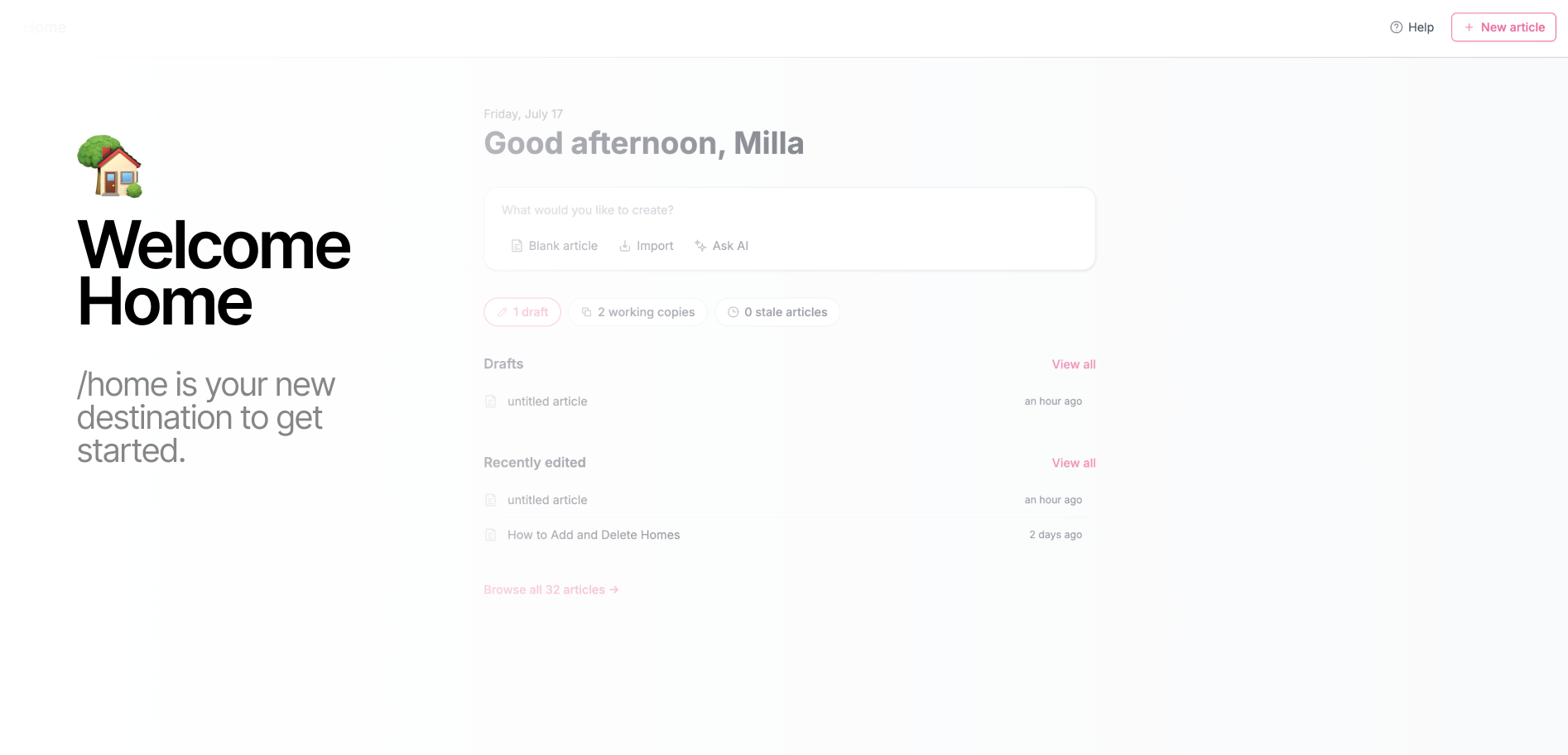
So we built a Home page that starts with exactly that. Open HelpDocs and Home now greets you by name and lays out what's actually on your plate:

  • Drafts. Every article you've started but not shipped, newest first, with a quick count up top so you know how big the pile is.
  • Working copies. The live articles you're mid-edit on, ready to pick back up.
  • Stale articles. Anything you've marked as needing a refresh, so it doesn't quietly rot at the bottom of your content list.
  • Recently edited. The things you touched last, right where you left them (that "Project kickoff guide" from 19 minutes ago? Right there).

Why we built it

A knowledge base is never really "done." There's always a draft you meant to finish, an article that's drifted out of date, an edit you started on Tuesday and got pulled away from. The work is there, it's just scattered.

Home pulls it into one view so the first thing you see is a clear answer to "okay, what was I doing?" No digging through Content, no trying to remember which article you left half-open. You land, you see where things stand, you get on with it.

The little counts up top (drafts, working copies, stale) are there for the quick gut-check too. Some days it's reassuring. Some days it's a gentle nudge. Either way, you know.

What you need to do

Nada! Home is live for everyone now. Log in and it's the first thing you'll see. Click any article to jump straight back into it, or hit View all on Drafts or Recently edited to see the full list.

Go see what's waiting for you.

improvement

Your KB now loads up to 85% faster

Speed has always been the quiet hero of a good knowledge base. Nobody writes in to say "wow, that page loaded quickly," but everybody notices when it doesn't. A reader who's already a little frustrated. They've got a problem, that's why they're here. Doesn't have much patience left for a loading spinner.

So we went under the hood and reengineered how knowledge bases load from the ground up.

The result: we've cut response times by up to 85%. In practice that means your docs feel near-instant, whether someone's landing on your homepage, digging through search, or opening the one article that's about to save their afternoon.

Why we did this

Faster pages aren't just a nicer feeling, they do real work for you. Readers find answers before they give up and open a ticket. Search engines reward the speed, so your docs show up more often. And on a shaky hotel wifi connection or a phone with two bars, the difference between "loads" and "loads eventually" is the difference between a reader you helped and one you lost.

We also just think this stuff should be quick. You put the work into your content β€” it should show up as fast as your readers can ask for it.

What you need to do

Nothing πŸ™‚

This is already live for every knowledge base, on every plan. No settings to flip, no toggles to find, no migration. Open your docs and they should simply feel snappier.

If you've got a knowledge base you'd call big (thousands of articles, lots of traffic) we'd love to hear how it feels now. That's exactly where this work pays off most.

feature

Let us handle all your metadata with Bulk AI meta generation

Let's be honest: filling in article descriptions, short versions, and tags is the brussels sprouts of knowledge base work. Good for you, slightly joyless, and somehow always still on the to-do list.

So we taught HelpDocs AI to do it in bulk. Here's how to use it:

  1. Head to your Content page and check the articles you want to edit
  2. Hit Bulk edit β†’ Actions tab β†’ Generate AI metadata
  3. Let AI handle the descriptions, short versions, and tags for as many articles as you like in one go

There's also a handy overwrite toggle: leave it off to only fill in the blanks (great when you don't fancy checking every single article), or switch it on to refresh everything.

This feature is superb for filling in the gaps across older articles, polishing up a collection before launch, or finally clearing that backlog you've been politely ignoring since last summer 😎

A few quick notes:

  • This uses AI credits based on how much metadata you're generating, so you stay in control of the spend
  • You'll need HelpDocs AI on your plan
  • Make sure to enable "Generate article metadata" in your AI settings

Now go enjoy your afternoon. The metadata's handled.

feature

Machine translate one article into a dozen languages with a couple of clicks

Reaching readers in their own language has always been one of the highest-ROI things you can do for your knowledge base, but also one of the most tedious. Open the article. Copy. Translate. Paste. Repeat for every language you support.

Then do it all again next week when something changes.

Bulk machine translation skips all of that. Open any article, choose the languages you want to translate it into, and we'll spin up translated versions for each one in the background. You stay on the page and carry on with your day.

It works on a single article at a time, so you can roll out translations gradually. Start with your most-viewed docs, add languages as you learn where your readers are, and tidy up the auto-translated copy whenever you're ready.

Smaller barrier to going multilingual, fewer browser tabs, more readers helped.

Read the full how-to β†’

feature

Introducing Improve with AI

Available on: Bloom plan

This is one of the biggest features we've ever shipped. We are slightly unhinged about it πŸ™‚

Here's the question every knowledge base writer has asked themselves at 11pm on a Tuesday: I know this help article could be better, but what exactly is wrong with it? That's what we wanted to make easy to answer.

Improve with AI is a review, not a rewrite. Open any article, click the Improve button, and after some data crunching, your content gets the kind of structured feedback you'd hope for from a thoughtful teammate who actually read the whole thing.

What shows up on every run

  • A score, because numbers are honest in a way prose isn't
  • A one-line summary of what's working and what isn't
  • Suggestions grouped by category (Readability, Completeness, and friends)
  • Severity badges (Low, Medium, High) so you know what's a "fix today" vs a "fix when Mercury isn't in retrograde"
  • A "Near:" pointer to the exact paragraph each suggestion is about, so you stop hunting
  • A preview of every change before you apply it, because surprise rewrites are nobody's love language

Apply suggestions one at a time, or hit Apply all and let the good times roll

Two ways in, same destination

Suggestions are clickable in both places they show up. Tap one in the sidebar and you'll jump to the matching section in the Block Editor. Tap the highlighted block in the editor and the suggestion comes to you. Preview, approve, done. No scrolling back to find your place. No tab gymnastics.

The philosophy bit (skippable, but we mean it)

Every suggestion is located, categorized, severity-rated, and previewable before it touches your article. Nothing happens automatically. Nothing is hidden behind a "trust me." You stay in charge of every word that changes. This is the version of AI content tooling we always wanted to use ourselves. The one that explains more than it does.

One small confession

We ran Improve with AI on our help doc about Improve with AI. It scored 72. We're working on that.

The boring but important details

5 credits per analysis run. 1 credit per suggestion applied. And we're giving away 3 credits every analysis.

Live today for every customer on the Bloom plan. Account admins can flip it on in AI settings.

Try it on your busiest article first. That's where the wins hide.

Learn more over on the help article β†’

improvement

Your V5 template, your rules

Dark mode toggle was just the warm-up. We've added three more switches to flip, so your knowledge base can look exactly the way you want it to.

Mute the feedback faces

Maybe you've got feedback covered elsewhere, maybe some articles just don't need a verdict, or maybe you'd rather not know. Whatever the reason, you can now turn it off and reclaim that bit of real estate at the bottom of your articles.

Ghost the bylines

Love your team, but don't need their faces on every article? Switch authorship off and your articles will quietly stand on their own. Cleaner layout, more on-brand, no hard feelings.

Go solid on the homepage

Gradients are lovely. But sometimes you want something that says "we mean business" instead of "welcome to a sunset." A solid homepage header is now an option. Same vibes, less drama.

All four toggles (yep, dark mode is still hanging out there too) live in your V5 template settings in Brand. Go wild.

Read the full article β†’

feature

πŸ”’ IP Restriction

Available on: The Bloom plan

Need to keep your docs behind closed doors? Now you can lock down your knowledge base so only specific IP addresses can access it πŸ‘€

Head to Settings β†’ Access β†’ Options, add the IP addresses or CIDR ranges you want to allow, and hit save. Anyone outside those networks? They're not getting in.

It's perfect for internal company docs, partner portals, or anything you don't want the whole internet browsing. Add individual IPs like 192.168.1.100 or entire network ranges using CIDR notation like 192.168.1.0/24, whatever works for your setup.

Oh, and your team can always access the knowledge base regardless of their IP address. So you can manage content from anywhere without accidentally locking yourself out πŸ™Œ

IP restriction also plays nicely with other access controls like restricting to logged-in users, so you can layer up your security however you need.

Learn more about it over on our docs.

feature

Your Knowledge Base Now Speaks AI with llms.txt

Available on: Sprout & Bloom plans

You know how websites are built for humans? There's navigation, pretty colors, buttons, sidebars, footers. All that stuff that helps people find their way around.

AI doesn't need any of that. In fact, all that extra stuff just gets in the way. When an AI tool tries to read your knowledge base, it has to wade through a bunch of code and formatting to find the actual helpful content πŸ‘€

Based on your plan, your HelpDocs knowledge base can now automatically generate an llms.txt file. A simplified version of your docs that's easy for AI to read.

It's just a plain text file that says "here's what this knowledge base is about, and here's where to find the important stuff." No fancy formatting, no navigation menus, no distractions.

Once enabled through Settings > AI, you'll find yours at yourdomain.helpdocs.io/llms.txt.

Why This Matters

Better AI-Powered Answers. When someone asks ChatGPT or Perplexity a question about your product, those AI tools can check your llms.txt file and actually understand what your docs contain. That means they're more likely to give accurate answers based on your real documentation instead of making stuff up.

Developers Get Help Faster. Building with an API or SDK? Developers can point AI coding assistants to your llms.txt to get a structured overview of your documentation. It's like giving AI a map to your knowledge base instead of making it wander around.

Future-Proof Your Content. The llms.txt standard is gaining serious traction. Anthropic, Cloudflare, and Perplexity have all adopted it. Your knowledge base stays ahead of the curve as AI continues to reshape how people find information.

Zero Work Required. We generate this file automatically from your existing content. No setup, no configuration, no extra maintenance. It just works.

Learn more about it over here β†’

roundup

Autumn 2025 Updates: What's New πŸ‚

It's been a super busy autumn for us of shipping exciting new updates to the HelpDocs platform. Here's what's newπŸ‘‡

  • Stats 2. Stop staring at numbers wondering "so what?" Stats 2 actually tells you what needs fixing. Self-Service Rate shows how well your docs work, Traffic Distribution reveals content health, and the Content tab calls out what's stale or abandoned.
  • Block Editor (Beta). Say goodbye to toolbar hunting! Our rebuilt editor is all about slash commands and drag-and-drop magic. Type / anywhere to summon what you need. Want to add an image mid-sentence? Just type /image right there. It's technical writing, but make it effortless ✨
  • Smoother Signups. No more making existing users fill out forms they've already filled out. One click and they're in.
  • Arcade Integration. Wanna create interactive demos? Just paste your Arcade link into the Block Editor. Done.
  • Template Options (V5). More customization, less code. Toggle dark mode now, more options coming soon.
  • The Little Things That Matter. Toasts that get out of your way, stale marking with common reasons pre-filled, better filtering, and drag-and-drop that just works.
  • Take a look at the full roundup over here β†’

feature

Highlight & rewrite with HelpDocs AI

Fancy making an update to your article with HelpDocs AI but don't want to rewrite the whole thing? Good news! You can now highlight and rewrite with the new Blocks Editor πŸ₯³

Just head to your article and then:

  1. Highlight the content you want to change
  2. Click the AI button in the toolbar
  3. Write a brief description of the change you'd like to make
  4. Click Rewrite

    Your content will now change inline and will be based solely on the content you highlighted. And if you'd like to rewrite the whole thing, the rewrite button is still there for you in the meta menu 😊

feature

Introducing the Block Editor: A Better Way to Write Documentation

We've rebuilt our text editor from scratch, and it's ready for you to try!

The new Block Editor replaces toolbar hunting with slash commands, drag-and-drop functionality, and instant content transformation. It's faster, cleaner, and built specifically for technical writers who want to focus on content instead of wrestling with tools.

Take a look at the docs over here β†’

What's new:

Slash commands replace toolbar buttons. Type / anywhere in your article to pull up contextual menus. Need a callout? Type /callout. Want a code block? Try /code. You can even insert elements inside existing blocks. Type /image in a text block and you're done. No clicking required.

Drag and drop editing. Rearrange elements by dragging them exactly where you want them. Moving content around your articles is now as simple as it should be.

Smart element conversion. Transform content types without starting over. Change a paragraph into a callout, turn text into a code block. The editor adapts to what you need.

Enhanced performance. Faster loading times and a smoother editing experience mean less waiting, more writing.

All your familiar blocks are here. HTML blocks, code blocks, quotes. Everything you're used to working with is still available, just easier to access.

Ready to try it?

The Block Editor is currently in beta. Enable it by opening any article, clicking ☰ More > Upgrade to new WYSIWYG.

We'd love to hear what you think as you use it. Your feedback helps us make it better.

improvement

Simplified signup flow

You know that moment when you invite a teammate who already uses HelpDocs, and they're like "Wait, why am I signing up again?". Yeah, we fixed that.

Here's What's New

  • If you're inviting people: When you send an invitation, your new teammate shows up right in your Users table with a little "invited" badge. No hunting around in separate invitation flows, everyone's in one place where you can actually see them.
  • If you already have a HelpDocs account: Got invited to join another account? Just click Accept invitation and you're in. No more pretending you're a brand new user.
  • If you're new to HelpDocs: Nothing changes for you! You'll still create your account the same way you always would.

Why We Did This

Let's be honest, the old way was kind of annoying. We were basically asking people who already had accounts to jump through the same hoops as first-time users. It didn't make sense, and we heard you.

Now everyone gets the experience that actually makes sense for them. Existing users get a shortcut, new users get the full onboarding, and admins get a clearer view of who's who.

improvement

Stale status refresh

Using our Stale feature is even easier (and quicker!) to use. We now provide common pre-defined Stale reasons, so it's just a few clicks to set an article as outdated.

We've also improved the flow, so it's more obvious when you're updating a Stale status or setting a new one.

Learn more about using Stale in our docs.